5.2. Bootstrap 3 Grid system
In order to take full advantage of djangocms-cascade, you should be familiar with the concepts of the Bootstrap Grid System, since all other Bootstrap components depend upon.
5.2.1. Bootstrap Container
A Container is the outermost component the Bootstrap framework knows of. Here the designer can specify the breakpoints of a web page. By default, Bootstrap offers 4 breakpoints: “large”, “medium”, “small” and “tiny”. These determine for which kind of screen widths, the grid system may switch the layout.
The editor window for a Container element offers the possibility to deactivate certain breakpoints. While this might make sense under certain conditions, it is safe to always keep all four breakpoints active, since this gives the designer of the web page the maximum flexibility.
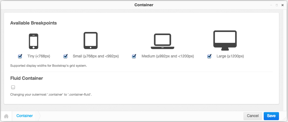
5.2.1.1. Small devices exclusively
If the web page shall be optimized just for small but not for large devices, then disable the breakpoints for Large and/or Medium. In the project’s style-sheets, the maximum width of the container element then must be reduced to that chosen breakpoint:
@media(min-width: 1200px) {
  .container {
    max-width: 970px;
  }
}
or, if you prefers the SASS syntax:
@media(min-width: $screen-lg) {
  .container {
    max-width: $container-desktop;
  }
}
5.2.1.2. Large devices exclusively
If the web page shall be optimized just for large but not for small devices, then disable the breakpoints for Tiny and/or Small.
Changing the style-sheets then is not required for this configuration setting.
5.2.1.3. Fluid Container
A variant of the normal Bootstrap Container is the Fluid Container. It can be enabled by a checkbox in the editors window. Fluid Containers have no hards breakpoints, they adopt their width to whatever the browser pretends and are slightly larger than their non-fluid counterpart.
A fluid container makes it impossible to determine the maximum width of responsive images for the
large media breakpoint, because it is applied whenever the browser width extends 1200 pixels,
but there is no upper limit. For responsive images in the smaller breakpoints (“tiny”, “small”
and “medium”) we use the width of the next larger breakpoint, but for images in the “large” media
breakpoints we somehow must specify an arbitrary maximum width. The default width is set to 1980
pixels, but can be changed, to say 2500 pixels, using the following configuration in your
settings.py:
CMSPLUGIN_CASCADE = {
    ...
    'bootstrap3': (
        ('xs', (768, 'mobile', _("mobile phones"), 750, 768)),
        ('sm', (768, 'tablet', _("tablets"), 750, 992)),
        ('md', (992, 'laptop', _("laptops"), 970, 1200)),
        ('lg', (1200, 'desktop', _("large desktops"), 1170, 2500)),
    ),
}
Note
Fluid container are specially useful for Hero images, full-width Carousels and the Jumbotron plugin. When required, add a free standing fluid container to the placeholder and as it’s only child, use the picture or carousel plugin. Its content then is stretched to the browser’s full width.
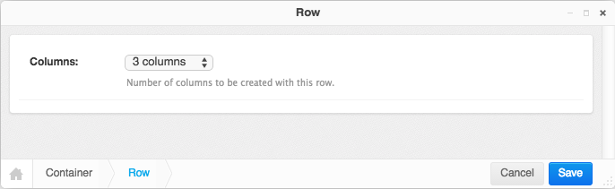
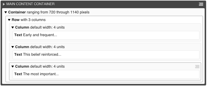
5.2.2. Bootstrap Row
Each Bootstrap Container may contain one or more Bootstrap Rows. A row does not accept any configuration setting. However, while editing, one can specify the number of columns. When adding or changing a row, then this number of columns are added if its value exceeds the current number of columns. Reducing the number of columns does not delete any of them; they must explicitly be chosen from the context menu in structure view.
5.2.4. Column
In the column editor, one can specify the width, the offset and the visibility of each column. These values can be set for each of the four breakpoints (tiny, small, medium and large), as specified by the Container plugin.
At the beginning this may feel rather complicate, but consider that Bootstrap 3 is mobile first, therefore all column settings, first are applied to the narrow breakpoints, which later can be overridden for larger breakpoints at a later stage. This is the reason why this editor starts with the column widths and column offsets for tiny rather than for large displays.
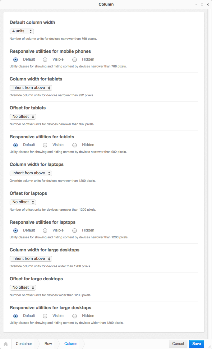
Note
If the current column is member of a container which disables some of its breakpoints (large, medium, small or tiny), then that column editor shows up only with the input fields for the enabled breakpoints.
5.2.5. Complete DOM Structure
After having added a container with different rows and columns, you may add the leaf plugins. These hold the actual content, such as text and images.
By pressing the button Publish changes, the single blocks are regrouped and displayed using the Bootstrap’s grid system.
5.2.6. Adding Plugins into a hard coded grid
Sometimes the given Django template already defines a Bootstrap Container, or Row inside a Container element. Example:
<div class="container">
    {% placeholder "Row Content" %}
</div>
or
<div class="container">
    <div class="row">
        {% placeholder "Column Content" %}
    </div>
</div>
Here the Django templatetag {% placeholder "Row Content" %} requires a Row- rather than a
Container-plugin; and the templatetag {% placeholder "Column Content" %} requires a
Column-plugin. Hence we must tell djangocms-cascade which breakpoints shall be allowed and what
the containers extensions shall be. This must be hard-coded inside your setting.py:
CMS_PLACEHOLDER_CONF = {
    # for a row-like placeholder configuration ...
    'Row Content': {
        'plugins': ['BootstrapRowPlugin'],
        'parent_classes': {'BootstrapRowPlugin': []},
        'require_parent': False,
        'glossary': {
            'breakpoints': ['xs', 'sm', 'md', 'lg'],
            'container_max_widths': {'xs': 750, 'sm': 750, 'md': 970, 'lg': 1170},
            'fluid': False,
            'media_queries': {
                'xs': ['(max-width: 768px)'],
                'sm': ['(min-width: 768px)', '(max-width: 992px)'],
                'md': ['(min-width: 992px)', '(max-width: 1200px)'],
                'lg': ['(min-width: 1200px)'],
            },
        }
    },
    # or, for a column-like placeholder configuration ...
    'Colummn Content': {
        'plugins': ['BootstrapColumnPlugin'],
        'parent_classes': {'BootstrapColumnPlugin': []},
        'require_parent': False,
        'glossary': {
            'breakpoints': ['xs', 'sm', 'md', 'lg'],
            'container_max_widths': {'xs': 750, 'sm': 750, 'md': 970, 'lg': 1170},
            'fluid': False,
            'media_queries': {
                'xs': ['(max-width: 768px)'],
                'sm': ['(min-width: 768px)', '(max-width: 992px)'],
                'md': ['(min-width: 992px)', '(max-width: 1200px)'],
                'lg': ['(min-width: 1200px)'],
            },
        }
    },
}
Please refer to the DjangoCMS documentation for details about these settings with the exception
of the dictionary glossary. This latter setting is special to djangocms-cascade: It gives
the placeholder the ability to behave like a plugin for the Cascade app. Remember, each
djangocms-cascade plugin stores all of its settings inside a Python dictionary which is
serialized into a single database field. By having a placeholder behaving like a plugin, here this
so named glossary is emulated using an additional entry inside the setting
CMS_PLACEHOLDER_CONF, and it should:
- include all the settings a child plugin would expect from a real container plugin
- reflect how hard coded container was defined (e.g. whether it is fluid or not)
5.2.7. Nested Columns and Rows
One of the great features of Bootstrap is the ability to nest Rows inside Columns. These nested Rows then can contain Columns of 2nd level order. A quick example:
<div class="container">
  <div class="row">
    <div class="col-md-3">
      Left column
    </div>
    <div class="col-md-9">
      <div class="row">
        <div class="col-md-6">
          Left nested column
        </div>
        <div class="col-md-6">
          Right nested column
        </div>
      </div>
    </div>
  </div>
</div>
rendered, it would look like:
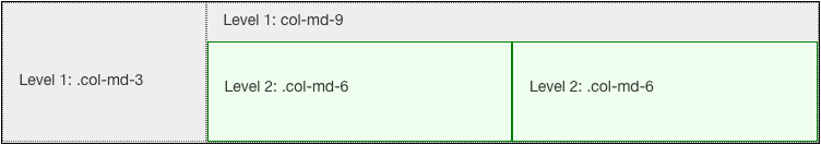
If a responsive image shall be placed inside a column, we must estimate the width of this image, so that when rendered, it fits exactly into that column. We want easy-thumbnails to resize our images to the columns width and not having the browser to up- or down-scale them.
Therefore djangocms-cascade keeps track of all the breakpoints and the chosen column widths. For simplicity, this example only uses the breakpoint “medium”. The default Boostrap settings for this width is 992 pixels. Doing simple math, the outer left column widths gives 3 / 12 * 992 = 248 pixels. Hence, adding a responsive image to that column means, that easy-thumnails automatically resizes it to a width of 248 pixels.
To calculate the width of the nested columns, first evaluate the width of the outer right column, which is 9 / 12 * 992 = 744 pixels. Then this width is subdivided again, using the width of the nested columns, which is 6 / 12 * 744 = 372 pixels.
These calculations are always performed recursively for all nested column and for all available breakpoints.
Warning
As the name implies, a container marked as fluid, does not specify a fixed width. Hence instead of the inner width, the container’s outer width is used as its maximum. For the large media query (with a browser width of 1200 pixels or more), the maximum width is limited to 1980 pixels.