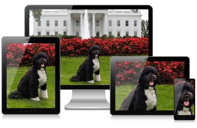
HTML5 <picture> and the new <img> elements
Bootstrap’s responsive grid system, helps developers to adapt their site layout to a wide range of
devices, from smart-phones to large displays. This works fine as long as the content can adopt to
the different widths. Adding the CSS class img-responsive to an <img ... /> tag, resizes
that image to fit into the surrounding column. However, since images are delivered by the server
in one specific size, they either are too small and must be upscaled, resulting in an grainy image,
or are too big, resulting in a waste of bandwidth and slowing down the user experience, when surfing
over slow networks.
Adaptive resizing the images
An obvious idea would be to let the server decide, which image resolution fits best to the browsing device. This however is bad practice. Images typically are served upon a GET-request pointing onto a specific URL. GET-requests shall be idempotent and thus are predestined to be cached by proxies on the way to the client. Therefore it is a very bad idea to let the client transmit its screen width via a cookie, and deliver different images depending on this value.
Since the sever side approach doesn’t work, it is the browsers responsibility to select the appropriate image size. An ideal adaptive image strategy should do the following:
- Images should fit the screen, regardless of their size. An adaptive strategy needs to resize the image, so that it can resize into the current column width.
- Downloading images shall minimize the required bandwidth. Large images are enjoying greater popularity with the advent of Retina displays, but those devices normally are connected to the Internet using DSL rather than mobiles, which run on 3G.
- Not all images look good when squeezed onto a small display, particularly images with a lot of detail. When displaying an image on a mobile device, you might want to crop only the interesting part of it.
As these criteria can’t be fulfilled using the well known <img src="..." /> element,
djangocms-cascade offers two responsive variants recently added to the HTML5 standard:
One is the <img> tag, but with the additional attributes sizes and srcset. This element
can be used as a direct replacement for <img src="...">.
The other is a new element named <picture>. Use this element, if the image’s shape or details
shall adopt their shape and/or details to the displaying media device. The correct terminology for
this kind of behavior is art direction.

But in the majority of use cases, the Bootstrap Image Plugin will work for you. Use the Bootstrap Picture Plugin only in those few cases, where in addition to the image width, you also want to change the aspect ratio and/or zoom factor, depending on the display’s sizes.
Using these new elements, the browser always fetches the image which best fits the current layout. Additionally, if the browser runs on a high resolution (Retina) display, an image with double resolution is downloaded. This results in much sharper images.
Browser support
Since Chrome 38, the <img ... /> element fully supports srcset and sizes. It also supports
the <picture> element right out of the box. Here is a list of native browser support for the
picture and the image element with attribute srcset.
For legacy browsers, there is a JavaScript library named picturefill.js, which emulates the built in behavior of these new features. But even without that library, djangocms-cascade renders these HTML elements in a way to fall back on a sensible default image.
Image Plugin Reference
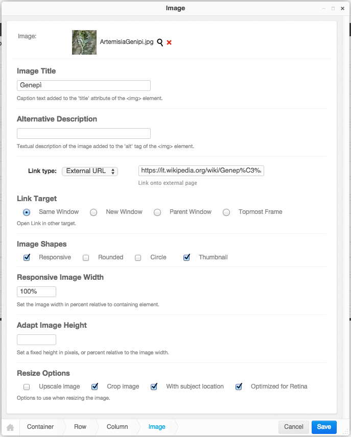
In edit mode, double clicking on an image, opens the Image Plugin editor. This editor offers the following fields in order to adapt an image to the current layout.

Image
Clicking on the magnifying glass opens a pop-up window from django-filer where you can choose the appropriate image.
Image Title
This optional field shall be used to set the <img title="some text" .../> tag inside this HTML
element.
Alternative Description
This field shall be used to set the alt tag inside the <picture> or <img>
element. While the editor does require this field to be filled, it is strongly recommended to add
some basic information about that picture.
Link type
Using this select box, one can choose to add an internal, or external link to the image. Please check the appropriate section for details.
Image Shapes
These checkboxes control the four CSS classes from the Bootstrap3 framework: img-responsive,
img-rounded, img-circle and img-thumbnail. While rendering HTML, they will be added to
the <img ... /> element.
Here the option Responsive has a special meaning. The problem with responsive images is, that
their size depends on the media width of the device displaying the image. Therefore we can not use
the well known <img ... /> element with a fixed width=".." and height="..". Instead,
when rendering responsive images, the additional attributes srcset and sizes are added to
the element. The attribute srcset contains the URLs, of up to four differently scaled images.
The width of these images is determined by the maximum width of the wrapping container <div>,
normally a Bootstrap column.
Responsive Image Width
This field is only available for responsive images. If set to 100% (the default), the image will spawn the whole column width. By setting this to a smaller value, one may group more than one image side by side into one column.
Fixed Image Width
This field is only available for non-responsive images. Here an image size must be specified in
pixels. The image then will be rendered with a fixed width, independently of the current screen
width. Images rendered with a fixed width do not neither contain the attributes srcset nor
sizes.
Adapt Image Height
Leaving this empty (the default), keeps the natural aspect ratio of an image. By setting this to a
percentage value, the image’s height is resized to its current used width, hence setting this to
100% reshapes the image into a square. Note that this normally requires to crop the image,
see Resize Options below. Setting this value in pixels, set the image to a fixed height.
Resize Options
- Upscale image: If the original image is smaller than the desired drawing area, then the image is upscaled. This in general leads to blurry images and should be avoided.
- Crop image: If the aspect ratio of the image and the desired drawing area do not correlate, than the image is cropped to fit, rather than leaving white space arround it.
- With subject location: When cropping, use the red circle to locate the most important part of the image. This is a feature of Django’s Filer.
- Optimized for Retina: Currently only available for images marked as responsive, this option adds an images variant suitable for Retina displays.
Picture Plugin Reference
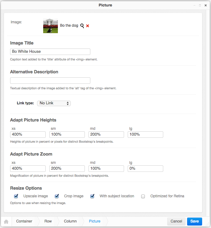
A picture is another wording for image. It offers some rarely required options when working with images using art direction. By double-clicking onto a picture, its editor pops up.

The field Image, Image Title, Alternative Description, Link type and Resize Options behave exactly the same as for the Image Plugin.
Beware that Pictures always are considered as responsive, and they always spawn to the whole width
of the wrapping element, using the CSS style width: 100%. They make the most sense for large
images extending over a large area. Therefore it is not possible to specify a width for a picture.
Adapt Picture Heights
Depending on the current screen’s width, one may set different heights for an image. This is useful in order to adopt the aspect ratio of an image, when switching from desktops to mobile devices. Normally, one should use a fixed height in pixels here, but when specifying the heights in percent, these heights are considered relative to the current image height.
Adapt Picture Zoom
Depending on the current screen’s width, one may set different zoom levels for an image. This is useful for keeping the level of detail constant, at the cost of cropping more of the image’s margins.